Symmetry by Kirsten Bruening
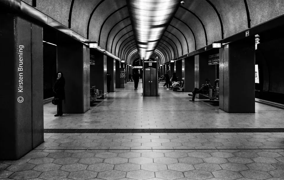
In 'Symmetry,' the photographer explores the classical Greek definition of the term—a pursuit of well-proportioned, harmonious design rather than mere geometric mirroring. By focusing on the interplay of light and shadow, the image captures a refined balance that elevates the subject into a study of form and structure. This photograph is award-worthy for its sophisticated interpretation of balance, demonstrating how a deliberate, moderate approach to composition can transform everyday subjects into timeless, evocative art. It stands as a testament to the power of monochromatic vision in revealing the inherent beauty within structured environments.
Kirsten Bruening
Based near Cologne, Germany, Kirsten Bruening is a dedicated photographer whose creative journey began in childhood with the tactile exploration of analogue film. After a fifteen-year hiatus, she returned to the craft with a renewed focus on the expressive potential of black and white imagery. Her work spans nature, portraiture, and wildlife, consistently highlighting her belief that the interplay of light and shadow is the most potent medium for conveying emotion. Currently, she is pursuing formal studies to further refine her technical expertise and artistic vision.
Resonance Score Breakdown
Transparency Note: The resonance score (9.1/20) is calculated based on social engagement metrics collected before the award announcement.
Expert Photography Reviews · 4
The Weight of Order
We build walls to keep the chaos out. We align stones, measure the distance between beams, and convince ourselves that if the lines are straight, the mind will follow. There is a comfort in the grid.
Read the reflection →The Architecture of Order
Seneca once observed that the universe is not a chaotic sprawl, but a coherent whole, governed by a rational order that we often fail to perceive because we are too close to the fray.
Read the reflection →Reviews & Comments
Share your thoughts about this award-winning photograph. Your reviews contribute to the community engagement score.
The frame’s geometry dictates the viewer’s path. Bruening’s vertical axis anchors the composition, forcing the eye into a rigid, rhythmic descent. It’s a disciplined study of spatial tension where the negative space doesn’t merely exist; it exerts pressure. I’ve grown weary of chaotic frames, but this one holds. The tonal distribution creates a fulcrum that keeps the structure from collapsing into mere decoration. It’s precise, cold, and entirely necessary. The architecture finally commands the silence it deserves.
Symmetry is a dangerous word in architecture, often masking a lack of spatial imagination. Here, the rigid fenestration creates a datum that feels almost suffocating. While the light raking across those concrete surfaces gives the mass a tactile weight, it’s a static, lonely view. I’m left wondering about the threshold—what’s behind me, and why is the space so devoid of life? It’s technically precise, sure, but it doesn’t capture the pulse of the building.
The light hits the concrete like a slow pan across a brutalist set. It’s quiet, heavy, and perfectly still. I’ve spent hours in editing suites chasing this kind of rhythm, where the shadows do the heavy lifting for the narrative. The geometry doesn’t just mirror; it breathes. It’s a frame the editor keeps because it’s already finished. Honestly, it makes me want to put down the camera and just watch the light shift for a while.
Symmetry isn’t merely geometry; it’s a quiet violence against chaos. Bruening’s Bochum architecture doesn’t just balance; it demands a reckoning with the void. I’ve stared at these concrete edges until my eyes ached, feeling the cold weight of the shadows pressing inward. It’s a stark, uncompromising refusal to let the light tell the whole story. When the darkness is this deliberate, it doesn’t hide the structure—it finally allows the structure to think. I find it haunting.